library(poorman)
library(readxl)
kFdr <- 0.05
df <- local({
kUrl <- paste0(
"https://drive.google.com/uc?export=download&",
"id=1xWVyoSSrs4hoqf5zVRgGhZPRjNY_fx_7"
)
temp_file <- tempfile(fileext = ".xlsx")
download.file(kUrl, temp_file)
df <- readxl::read_excel(temp_file, sheet = "mlx1 mutant LSD vs. HSD",
skip = 3)
df$direction <- with(df, poorman::case_when(
logFC > 0 & adj.P.Val < kFdr ~ "up",
logFC < 0 & adj.P.Val < kFdr ~ "down",
TRUE ~ "n.s."
))
df$direction <- factor(df$direction, levels = c("down", "up", "n.s."))
return(df)
})tl;dr
The ggiraph R package is my new favorite way to add interactivity to a ggplot.
Introduction
Last week I explored different ways to create collaborator-friendly volcano plots in R.
This week, a colleague asked me whether I could make it easier for them to identify which genes the points referred to. Luckily, there is no shortage of R packages to create interactive plots, including e.g. the plotly 1 or rbokeh packages. 2
Both plotly and ggiraph interface with the ggplot2 R package, allowing me to switch between interactive and non-interactive versions of my plots with ease.
First, let’s get some differential gene expression data, please see my previous post for details.
NoteRetrieving differential expression results from Mattila et al, 2015
Let’s retrieve a table with the results from a differential gene expression analysis by downloading an excel file published as supplementary table S2 by Mattila et al, 2015
A non-interactive volcano plot
Next, we create a volcano plot using ggplot2:
library(ggplot2)
ggplot2::theme_set(theme_linedraw(base_size = 14))
p <- ggplot(
data = df,
mapping = aes(x = logFC, y = -log10(P.Value), color = direction)
) +
scale_color_manual(values = c("up" = "#E41A1C",
"down" = "#377EB8",
"n.s." = "lightgrey"),
guide = "none") +
geom_point(size = 2, alpha = 0.4) +
labs(
x = "Fold change (log2)",
y = "-log10(p-value)"
) +
theme(panel.grid = element_blank())
print(p)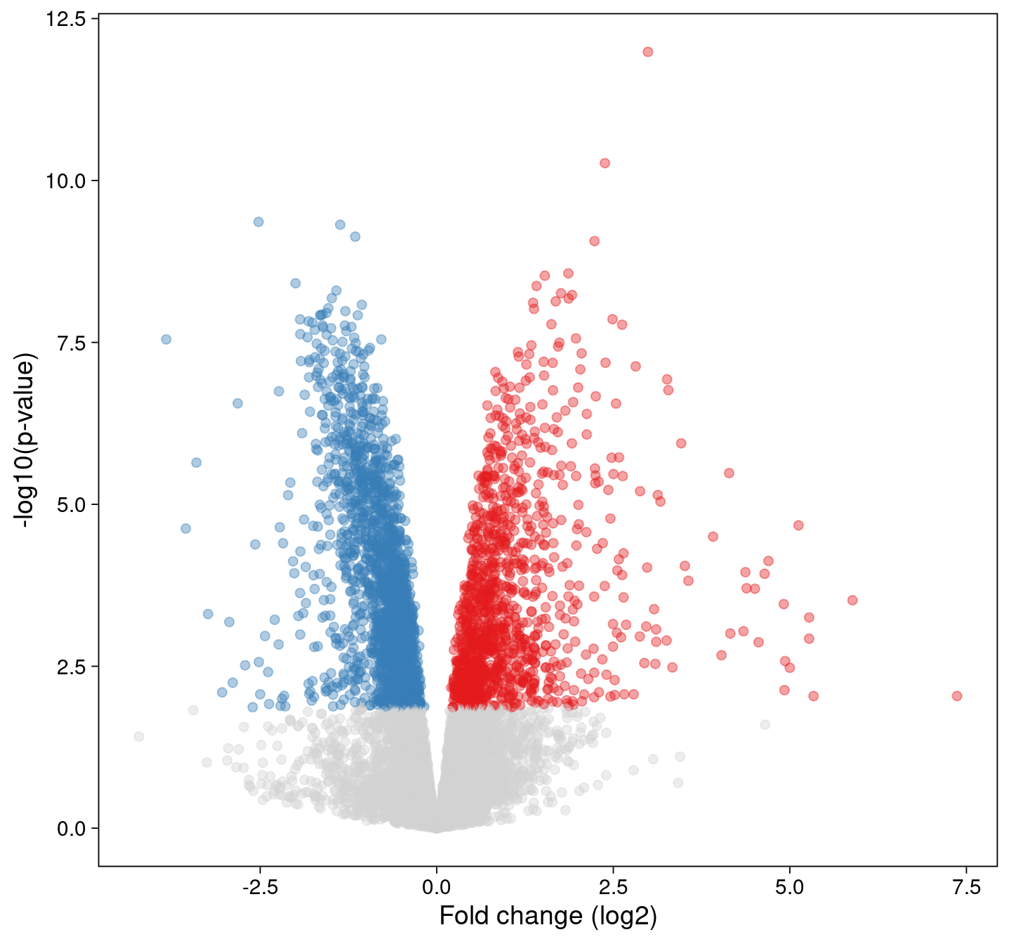
An interactive volcano plot
Adding a tooltip for each point is as easy as replacing the geom_point() call with its’ ggiraph::geom_point_interactive() companion.
To see the result, please hover your mouse over a point in the plot below:
library(ggiraph)
p <- ggplot(
data = df,
mapping = aes(x = logFC, y = -log10(P.Value), color = direction)
) +
scale_color_manual(values = c("up" = "#E41A1C",
"down" = "#377EB8",
"n.s." = "lightgrey"),
guide = "none") +
1 ggiraph::geom_point_interactive(
aes(
tooltip = sprintf("%s\nlogFC: %s\nFDR: %s",
Symbol,
signif(logFC, digits = 3),
signif(adj.P.Val, digits = 2)
)
),
hover_nearest = TRUE,
size = 3,
alpha = 0.4) +
labs(
x = "Fold change (log2)",
y = "-log10(p-value)"
) +
theme(panel.grid = element_blank())
2ggiraph::girafe(ggobj = p,
options = list(
opts_tooltip(use_fill = TRUE),
opts_zoom(min = 0.5, max = 5),
3 opts_sizing(rescale = FALSE),
opts_toolbar(saveaspng = TRUE, delay_mouseout = 2000)
)
)- 1
-
geom_point_interactive()understands thetooltipaesthetic, so we can display the gene symbol, the log2 fold change and the FDR for each gene. - 2
-
The
ggiraph::girafe()function turns ourggplotobject into an interactive graph, and its arguments define additional properties, e.g. the contents of the context menu, or the style of the tool tip information. - 3
-
By default,
ggiraphplots rescales to the size of the html container. To suppress this behavior, we setrescale = FALSEand rely on thefig-widthandfig-heightdefined in this quarto markdown document instead.
Combining ggrastr and ggiraph
Adding interactivity to the plot increases the size of the html page it is contained in. In case that’s a concern, e.g. when there are many plots on the same page, we can restrict the tool tips to a subset of the points, e.g. only those that pass our significance threshold.
We can also combine ggiraph with the ggrastr package, first plotting all points as a rasterized image (which does not encode the position of each point separately) - and then overlay transparent interactive points for the significant genes.
1library(ggrastr)
ggplot2::theme_set(theme_linedraw(base_size = 14))
p <- ggplot(
data = df,
mapping = aes(x = logFC, y = -log10(P.Value), color = direction)
) +
scale_color_manual(values = c("up" = "#E41A1C",
"down" = "#377EB8",
"n.s." = "lightgrey"),
guide = "none") +
2 ggrastr::geom_point_rast(size = 2, alpha = 0.4) +
ggiraph::geom_point_interactive(
3 data = poorman::filter(df, direction != "n.s."),
aes(
tooltip = sprintf("%s\nlogFC: %s\nFDR: %s",
Symbol,
signif(logFC, digits = 3),
signif(adj.P.Val, digits = 2)
)
),
hover_nearest = TRUE,
size = 3,
4 alpha = 0) +
labs(
x = "Fold change (log2)",
y = "-log10(p-value)"
) +
theme(panel.grid = element_blank())
ggiraph::girafe(ggobj = p,
options = list(
opts_tooltip(use_fill = TRUE),
opts_zoom(min = 0.5, max = 5),
opts_sizing(rescale = FALSE),
opts_toolbar(saveaspng = TRUE, delay_mouseout = 2000)
)
)- 1
-
The ggrastr R package offers drop-in replacements for
ggplot2functions that help reduce the size (and complexity) of graphics. - 2
- We add a rasterized layer with all points.
- 3
-
Subsetting the data.frame passed as the
dataargument restricts interactivity to only the significant genes. - 4
-
Because the points are already drawn by the
ggrastr::geom_point_rastfunction, we setalpha = 0to obtain transparent points that will trigger the display of the tool tip.
The ggiraph package comes with excellent documentation - check it out!
Reproducibility
Session Information
sessioninfo::session_info("attached")─ Session info ───────────────────────────────────────────────────────────────
setting value
version R version 4.3.2 (2023-10-31)
os Debian GNU/Linux 12 (bookworm)
system x86_64, linux-gnu
ui X11
language (EN)
collate en_US.UTF-8
ctype en_US.UTF-8
tz America/Los_Angeles
date 2024-04-13
pandoc 3.1.1 @ /usr/lib/rstudio/resources/app/bin/quarto/bin/tools/ (via rmarkdown)
─ Packages ───────────────────────────────────────────────────────────────────
! package * version date (UTC) lib source
P ggiraph * 0.8.9 2024-02-24 [?] RSPM
P ggplot2 * 3.5.0 2024-02-23 [?] RSPM
P ggrastr * 1.0.2 2023-06-01 [?] CRAN (R 4.3.1)
P poorman * 0.2.7 2023-10-30 [?] RSPM
P readxl * 1.4.3 2023-07-06 [?] CRAN (R 4.3.1)
[1] /home/sandmann/repositories/blog/renv/library/R-4.3/x86_64-pc-linux-gnu
[2] /home/sandmann/.cache/R/renv/sandbox/R-4.3/x86_64-pc-linux-gnu/9a444a72
P ── Loaded and on-disk path mismatch.
──────────────────────────────────────────────────────────────────────────────
This work is licensed under a Creative Commons Attribution 4.0 International License.
Footnotes
My previous favorite - also available for other languages including python.↩︎
See Robert Kabacoff’s “Modern Data Visualization with R” online book for some great examples.↩︎